Bad Examples

The following examples have been selected from the many excellent examples of what not to do at the User Interface Hall of Shame. Browsing this sight is both informative and entertaining.

Feedback

Super Toolbars for the patient 
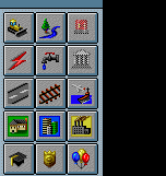
SimCity 2000 by Maxis is undoubtedly an engaging (OK, addictive) simulation game, but it does have one unnerving feature that can really interfere with a new user's ability to learn the game. Several of toolbar buttons (notably, not all of them) quite unexpectedly have submenus associated with them, which are available only when the user holds the mouse button down for a period of time after clicking on the toolbar button.

This feature was not immediately apparent after a quick review of the user manual, and the toolbar images provide no indication that this functionality exists. Nor is there any indication as to which toolbar images have submenus associated with them. The problem was clearly evident when one of our colleagues needed to add a power plant to his city: the help file merely stated that you simply clicked on the Power toolbar button, but after doing so, the user found that the action only added more power lines to the city. It was only after considerable trial and error (and the resultant frustration), that the user found that if you clicked and held the toolbar image down, a submenu offering power plants became available.

One further problem with this design strategy is that a normal button click on the toolbar image will perform the most recent submenu option, but the image provides no indication of which option that might have been. The end result is that the user ends up making many inadvertent selections, or learns to always wait for the submenu to appear before continuing, thereby reducing the efficiency of his or her task.


Locked-up again?!

John Winters sent along a series of screen prints illustrating the useless progress meters implemented in Microsoft's Outlook. When dealing with a single message, the application displays a 2-state progress bar: the program is either busy, or it's not. Retrieving a message with a 340KB attachment over a modem connection typically takes 1 minute and 45 seconds. During that time, the progress meter is shown at its maximum value, rather than displaying the relative progress of the retrieval (something progress meters are supposed to do). The likely result of this misimplementation is that the user will conclude the computer has yet again locked-up, and will perform a three-finger salute to get back to work.

Simple and Natural Dialog

Why bother to make it an option?

Grrrrr. Setting aside our feelings for Microsoft's policy of requiring Internet Explorer to successfully run Visual Studio applications, we found their method of indicating this requirement to be somewhat ... well, stupid. Since installing IE is a requirement, why use an checkbox to indicate whether or not you want to install it? You have no choice!. Unchecking the box has the effect of disabling the Next button, preventing the installation from continuing.

Speak the Users' Language

Olli Siltanen suggested we take a look at CSE HTML Validator v3.05, a program designed to check HTML documents for syntactical errors. We found this portion of its Options dialog to be particularly problematic.


Flag Day!


The "Flag" checkboxes are used to set validation and program options. Quick, here's a test:
  1. Which flag checks for tags specific to Internet Explorer?
  2. Which flag checks for tags specific to Netscape Navigator?
  3. Which flag displays a warning against the use of <CENTER> tags?
  4. Which flag controls whether sound is played during validation?
  5. What does Flag 14 do?

Here are the answers:

  1. Flag 1.
  2. Flag 2.
  3. Flag 9. It also warns against the use of <BASEFONT>, <FONT>, <S>, and <U> tags.
  4. Flag 10 of course.
  5. Nothing. OK, it's a trick question: flags 14-20 don't do anything; they are merely placeholders for possible future expansion.

Each flag controls the validation of several HTML tags; the user will have to visit the help file to determine the tags related to a particular flag. The existing design is merely a reflection of the programmer's model of the system, which in no way helps the user. The developer was concerned with making the program configurable for a variety of browsers and expandable to include changes to HTML specifications as they occur.

Hey, here's an idea: if Flag 1 represents IE-Specific, why not call it something like, oh, I don't know, maybe ... IE-Specific? We offer the following as an alternative design that would benefit both the user and the developer. The alternative provides immediate access to the definition of the program settings, and allows the developer to add additional capabilities in the future without changing the design of the form or its documentation.

An alternative...

Update 19-September-1999: in the recently released version 4.0 of CSE HTML Validator, the developers took a bad idea and made it far worse. Now rather than having to struggle with 20 flags, the user must contend with 60:
From absurd to preposterous...
An additional change in the new version was to employ an HTML-based help file, with a navigation structure that makes it even more difficult to find explanations for the flags.

Good Error Message

We are unfortunately all too familiar with the use of terms such as "Fatal Error", "Critical Error", and "Severe Error", but Ben Speakmon discovered an entirely new type of error in FreeJava:


With all due irreverence...

The message resulted when Ben invoked the Build command after editing a project. Apparently, FreeJava's developers consider the fact than an error occurred as being far more important than identifying the source of the error.


Keith Uher sent in this image of a useless message he received from RoboHelp, an otherwise very useful help documentation utility.


Why bother?

The message appears when generating a Word document from an online help project. It's great that the program offers the option of viewing the results, but in this case, it's the only option; the user cannot elect to not view the document. One would have thought that the very act of viewing the resulting document would have been sufficient indication that the conversion had completed.


Claes Tullbrink discovered this example of circular logic in RealPlayer for Windows, (v. 6.0.0.128):


Chicken or egg?

Consistency

"consistency makes the interface familiar and predictable"
(The Windows User Interface Guidelines for Software Design, Microsoft Press)


Button, Button, Who's got the button?

Our hope is that most Visual Basic 5.0 developers will learn about consistency from Microsoft's Design Guidelines rather than from using Microsoft's products. The image above is a compilation of various dialogs used in the VB5 programming environment. In many parts of the program, the VB5 development team relied on Microsoft's then newly adopted practice of locating command buttons horizontally aligned in the lower right corner of the dialog boxes. Unfortunately, the developers responsible for a large number of the functions in the product were not aware of the new "standard". In addition to the various positions illustrated here, dialog boxes provided by third-party add-ons to the product (e.g., Crystal Reports) utilized even more creative locations.

So Many Things Wrong That ...

Click & Print's Style Buddy

Click & Print Certificates is a useful little shareware program for printing a variety of certificates and awards. The program offers a "Style Buddy" to help the user select which of a number of certificates to print. Once you get past the obvious problems with the dialog (instructions in the title bar, right-aligned, vertically-oriented instructions, Cancel button before the OK button, reference to an "OKAY" button, the use of all capital letters, the hard-coded sickly green color, etc.), there are some important design problems related to the choice of control for selecting the desired style.

The various styles can be previewed through the use of the horizontal scroll bar; each click displays a different certificate style. There are two significant problems with this design. In the first place, the only way to determine which styles are available is to scroll entirely through each of the styles. A second problem is that the only way to select a particular style is to browse through all those that precede it. For example, to select the "Team Player" certificate, the user must click on the scroll bar 9 times, waiting for the program to load a preview of each of the 9 certificates that precede it.

We offer the following alternative to Click & Print's Style Buddy, which we feel resolves these problems.


A more usable alternative