User Interface/Interaction Design
One Aspect of Product Design
|
|
Prof. David Bernstein
James Madison University
|
|
| Computer Science Department |
| bernstdh@jmu.edu |

|
What is User Interface Design?
- Recall:
- Software product design is the process of specifying
software product features, capabilities and interfaces
to satisfy client needs and desires. (Fox, 2006)
- One Implication:
- Interface design is part of product design
What is a User Interface?
- Defined:
- A system that allows for interaction between a human
and a device
- Input:
- Keyboard (structured, natural language)
- Speech Recognition (structured, natural language)
- Pointing Devices
- Optical Gesture Recognition
- Output:
- Display (textual, graphical)
- Printer (textual, graphical)
- Speech Generation (structured, natural language)
- Haptic Devices
Some of the Physics, Biology and Psychology Behind User Interface Design
- The Senses and Sensors
-
Sight (i.e., the eye)
-
Sound (i.e., the ear)
- Touch
- Smell and Taste
- The Model Human Processor
- A simplified model human sensing, storage, and perception
Sight
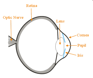
- The Eye:
- The Process within the Eye:
- Light waves (transverse electromagnetic waves) enter through the cornea
- Are focused by the lens
- Stimulate sensors in the retina
Sight (cont.)
- Rods:
- Output impacts our perception of luminance/brightness
- Cones:
- \(\beta\) sensors are sensitive to wavelengths
between 400 and 550 nm, but are most sensitive to a
wavelength of 450 nm (what we call blue)
- \(\gamma\) sensors are sensitive to
wavelengths between 420 and 660 nm, but are most
sensitive to a wavelength of 540 nm (what we call
green)
- \(\rho\) sensors are sensitive to wavelengths
between 400 and 700 nm, but are most sensitive to a
wavelength of 580 nm (what we call red)
- Lens:
- Highly separated wavelengths can't be focused
simultaneously
- Yellows with age (and, hence, filters out blue wavelengths)
Hearing
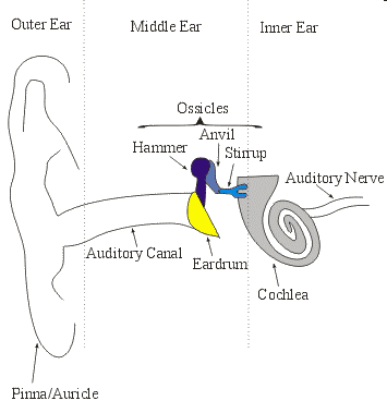
- The Ear:
- The Process within the Ear:
- Sound waves (longitudinal mechanical waves) are collected by the auricle
- Pressure changes cause the eardrum to vibrate
- Vibrations are amplified by the ossicles
- Vibrations are transferred to endolymph fluid
in the cochlea
- The basilir membrane vibrates at a particular
location
- The stereocilia stimulate sensory cells
- The resulting electrical impulses are transmitted by the
auditory nerve
Hearing (cont.)
- Volume:
- Difference in amplitude (measured in decibels)
- Audible Sounds: 0dB
- Painful Sounds: 120dB
- Pitch:
- Differences in frequency (measured in Hz)
- Acoustic Signals: 15Hz to 18kHz
- Timbre:
- Pronounced tam-bur
- Includes the waveform's distribution of energy at
different frequencies (i.e., spectra) and
its envelopes/transients (i.e., the attack,
sustain and decay)
The Model Human Processor (Card, Moran and Newell; 1983)
- Motivation:
- Interaction involves the user providing input to the computer
in response to a change in the user interface
- This involves sensing, processing/perception
and physical movement
- A Difficulty:
- These are very complicated processes
- Our Approach:
- Use a low-resolution model
The Model Human Processor (cont.)
- Perceptual Processor:
- Takes inputs from the eyes and ears
- Makes changes to the visual image store and auditory
image store in working memory
- Processing times of 50-200 millis
- Motor Processor:
- Controls muscles
- Processing times of 25-170 millis
- Cognitive Processor:
- Operates on data from working memory and long-term memory
- Makes changes to working memory
- Processing times of 30-100 millis
The Model Human Processor (cont.)
- Working Memory:
- Capacity of 5-9 (\(7 \pm 2\)) "chunks"
- Decays in 5-226 sec
- Rehearsal slows decay; interference hastens decay
- Visual Image Store:
- A frame is represented/encoded as a description
- Each frame is 7-17 "chunks"
- Each frame decays in 70-1000 millis
- Auditory Image Store:
- A sound is represented/encoded as samples
- Each sound is 4.4-6.2 "chunks"
- Each sound decays in 900-3500 millis
Fitts's Law
- Putting It All Together:
- The time to acquire a target (\(T\))
is a function of the distance to (\(D\))
and size of (\(S\)) the target
- \(T = a + b \cdot \log(D/S + 0.5)\)
- Implications for GUIs:
- Location matters
- Size matters
Analysis for User Interface Design
- Analysis for Product Design:
- Other Aspects - Lists of needs and desires focus on functionality
(i.e., "what")
- UI Design - Focuses on the form of the interaction
(i.e., "how")
- Understanding the Form:
- Characterizing users based on how they will use the system
- Understanding the workflow (i.e., how various functions will
be combined)
Analysis for User Interface Design (cont.)
- Characterize/Categorize Users Based On:
- Education/training
- Familiarity/expertise with input devices
- Age
- Sex/Gender
- Language
- Domain/application expertise
- Identify Workflows:
- The order in which the tasks (from the list of needs and
desires) will be performed
- Keep in Mind:
- 80% of users use a small number of features;
20% of users use a large number of features
Resolution for User Interface Design
- Parts of the Process:
- Define interface objects
- Define events that will cause changes to the state of
the UI
- Depict each state of the UI
- Indicate how the user should interpret the depiction
- Iterations:
- Early depictions/prototypes are often low fidelity (e.g.,
storyboards on paper)
- Later depictions/prototypes are often simulations with a
human in the loop
- "Final" depictions/prototypes eliminate the human
Resolution for User Interface Design (cont.)
- Formative Evaluation of Early Protoypes:
- Use guidelines/heuristics (e.g., from Nielsen,
Tognazzini, Norman, etc...)
- Formative Evaluation of Later Protoypes:
Guidelines related to Cognitive Processing
- Simplicity/Clarity:
- Break long/complex sequences/tasks into
shorter/simpler sequences/tasks
- Avoid ambiguity
- Consistency/Stability ("Principle of Least Astonishment"):
- Use consistent terminology, icons, colors, etc...
within the product
- Familiarity:
- Be consistent with expectations from other products
- Be consistent with the real world (e.g., use appropriate
metaphors)
Guidelines related to Cognitive Processing (cont.)
- Discoverability:
- Allow users to discover functionality
- Availability:
- "Important" features should be readily available
- Provide alternative ways to access features/accomplish
tasks
- Responsiveness:
- Provide articulatory feedback (i.e., about physical
actions) and semantic feedback (i.e., about intentions)
as quickly as possible
- Use user-centered (rather than product-centered) messages
(e.g., don't include messages like "Error 101")
- Forgiveness:
- Allow users to fix mistakes
Guidelines Related to Perception
- Text:
- Don't user more than 3 fonts
- Don't use more than 4 different font sizes
- Use sans-serif fonts for headings/titles; use serif fonts for
text (though sans-serif fonts are a little easier to read
on displays)
- Use case appropriately
- Use underlining sparingly
- Use italics and bold consistently
- Use concise, unambiguous language
- Color:
- Don't use red or green in the periphery of the
visual field
- Don't use red/green, blue/yellow, green/blue, and/or
red/blue combinations
Guidelines Related to Perception (cont.)
- Layout:
- Don't change much from "screen to screen" within a task
- Keep related items near each other and unrelated
items far from each other (i.e., group by proximity)
- Provide an initial point of focus
- Use a balanced layout (i.e., distribute elements
equally around an axis or axes)
- Labels can be aligned on the left OR right;
Widgets/controls should be aligned on the left AND right
- Dynamics:
- Use animation to clarify consequences
- Use animation to slow processing to a human time frame
- Contrast:
- Use contrast (in color, texture, shape, position, orientation,
size) to display salient differences in easily perceptible
and appropriate ways
Guidelines Related to Perception (cont.)
Nerd Humor

(Courtesy of xkcd)
Formative User Testing
- Participants:
- User - Thinks aloud while performing tasks
- Facilitator - Provides the tasks and encourages discourse
- Observer - Watch for and record critical incidents
- Study Design:
- In practice, a single user will find 12%-60% of
usability problems
- So (for each category of user) 5 users will find
most (typically 85%) problems


