|
Cascading Stylesheets (CSS)
An Introduction |
|
Prof. David Bernstein
|
| Computer Science Department |
| bernstdh@jmu.edu |
link element with
rel="stylesheet", type="text/css",
and an appropriate href
media attribute (which can take values like
handheld, print, and
screen; can include operators like
and and or; and can use properties
like height and width)
can be used to choose between different stylesheets
(e.g., media="screen and (max-width:600px)"
indicates that this stylesheet should only be loaded
for screens with a width of 600px or less)<?xml-stylesheet type="text/css" ?>
processing instruction that has an appropriate
href
12.5pt)in, cm,
mm, pt (1/72 of an inch),
pc (12pt), px (0.75pt),
vh (1% of the viewport height) and
vw (1% of the viewport width).
120%)red,
Background) or an RGB value#f00),
#RRGGBB (e.g., #ff0000), or
rgb(R,G,B) (e.g., rgb(255,0,0) or
rgb(100%,0%,0%))
background-color, background-image
font-family, font-size,
font-style, font-weight
text-align, text-decoration,
text-indent, text-transform
* {color: black}
em {font-style: italic}
input+label {color: red}
figure figcaption{font-size: 10pt}
body > p {font-family: sans-serif}
p[class="opening"] {text-indent: 5ex}
a:hover {color: red}
p.opening {text-indent: 0ex}
p#warning {color: red}
id:
class:
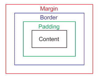
margin-top, margin-right,
margin-bottom, margin-left,
padding-top, padding-right,
padding-bottom, padding-left,
border-top, border-right,
border-bottom, and border-left)
border-width, border-color,
and border-style are also properties display property
which can be inline, block,
list-item, table-row,
table-column, etc...
top, right,
bottom and left Properties:
position Property:
static - use the normal flow (i.e.,
ignore top, right,
bottom and left) relative - use the normal flow and then
offset the boxabsolute - top, right,
bottom and left specify the
position